Client: FOR GOODNESS SHAKES
For Goodness Shakes
The Simple Glow of Wellness
Client
FOR GOODNESS SHAKES
Scope
Brand Strategy
Brand Design
Packaging Design
Brand Design
Packaging Design
Summary
Awareness of the role of nutrition in overall well-being continues to grow at pace. And protein is the word on everyone’s lips and in everyone’s basket. A cross-category-new-category all of its own.
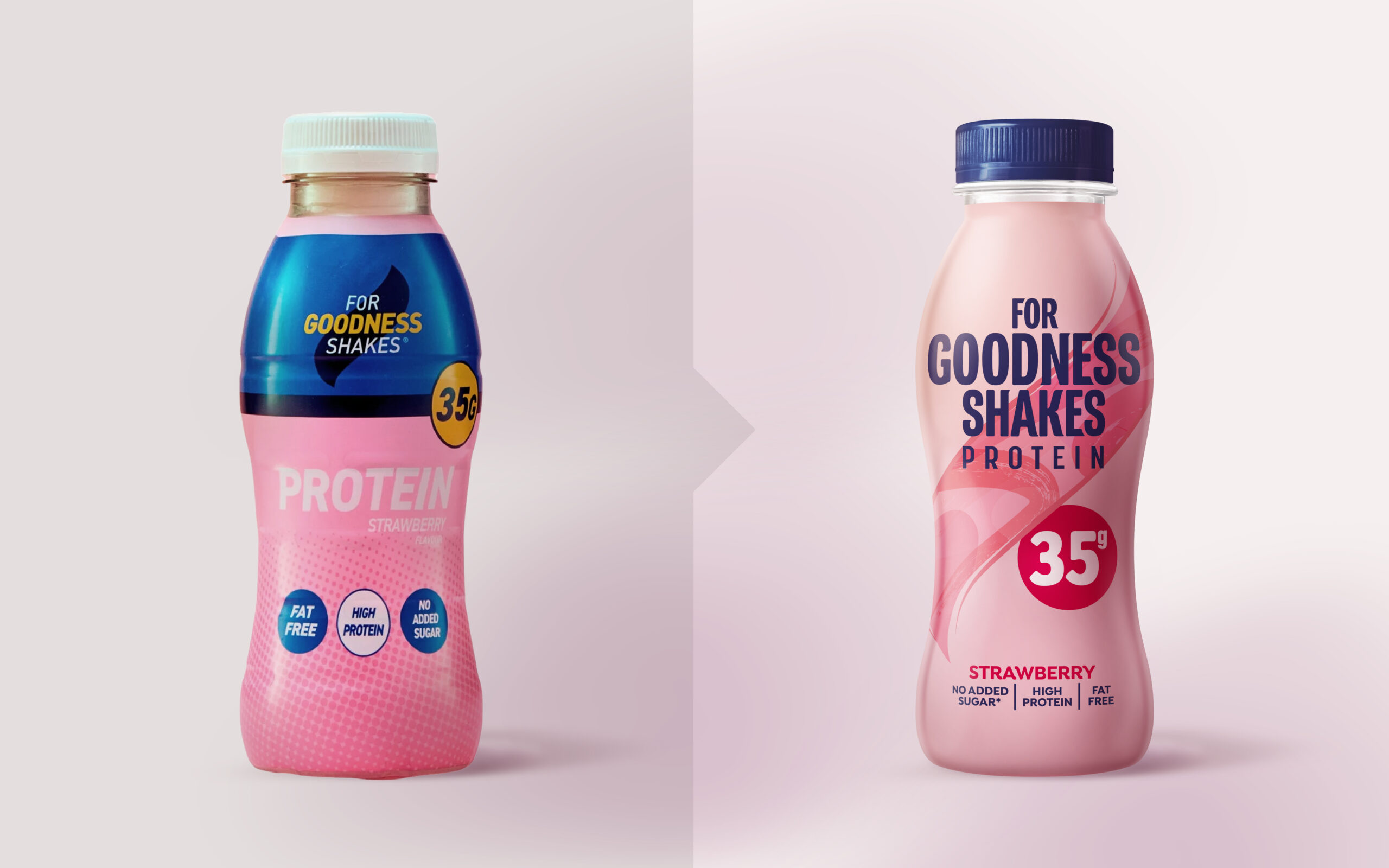
Back in 2003 when ‘For Goodness Shakes’, was created, it firmly belonged in the fitness world. But times have changed and to stay relevant and salient FGS needed to change, too.
Back in 2003 when ‘For Goodness Shakes’, was created, it firmly belonged in the fitness world. But times have changed and to stay relevant and salient FGS needed to change, too.
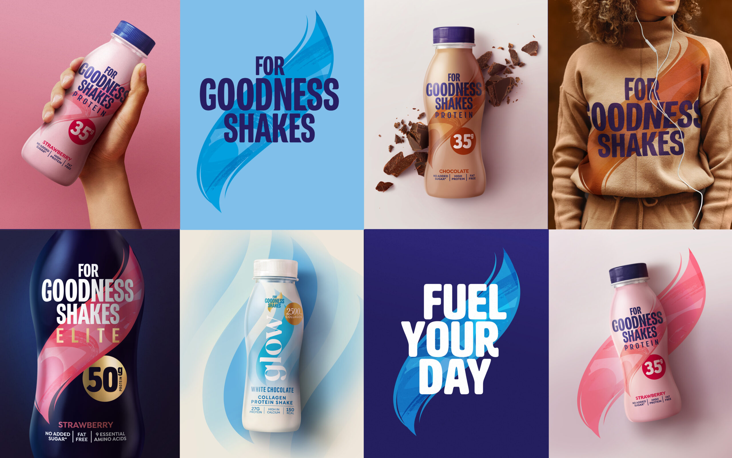
In working with FGS we looked long and hard at the cultural and social trends that might have an influence on our repositioning. Without losing touch with loyalists, the new positioning and subsequent design of For Goodness Shakes takes one step backwards in order to take two forwards, embracing the original innocent optimism in the very name of the brand, perhaps ironically making it more relevant than ever.
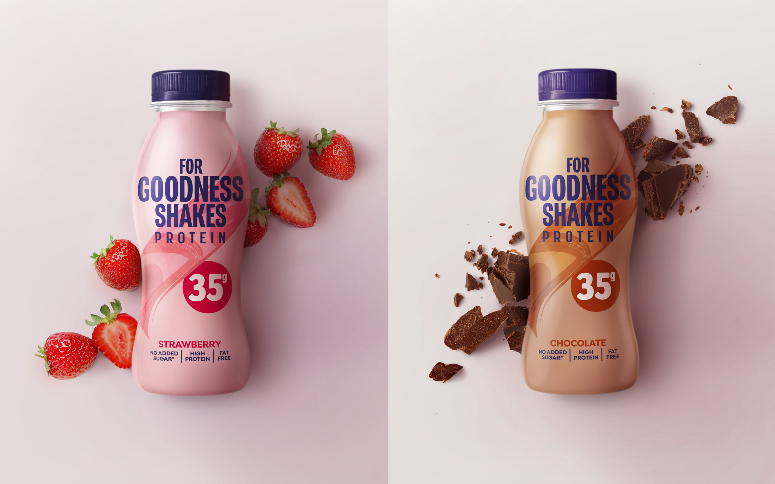
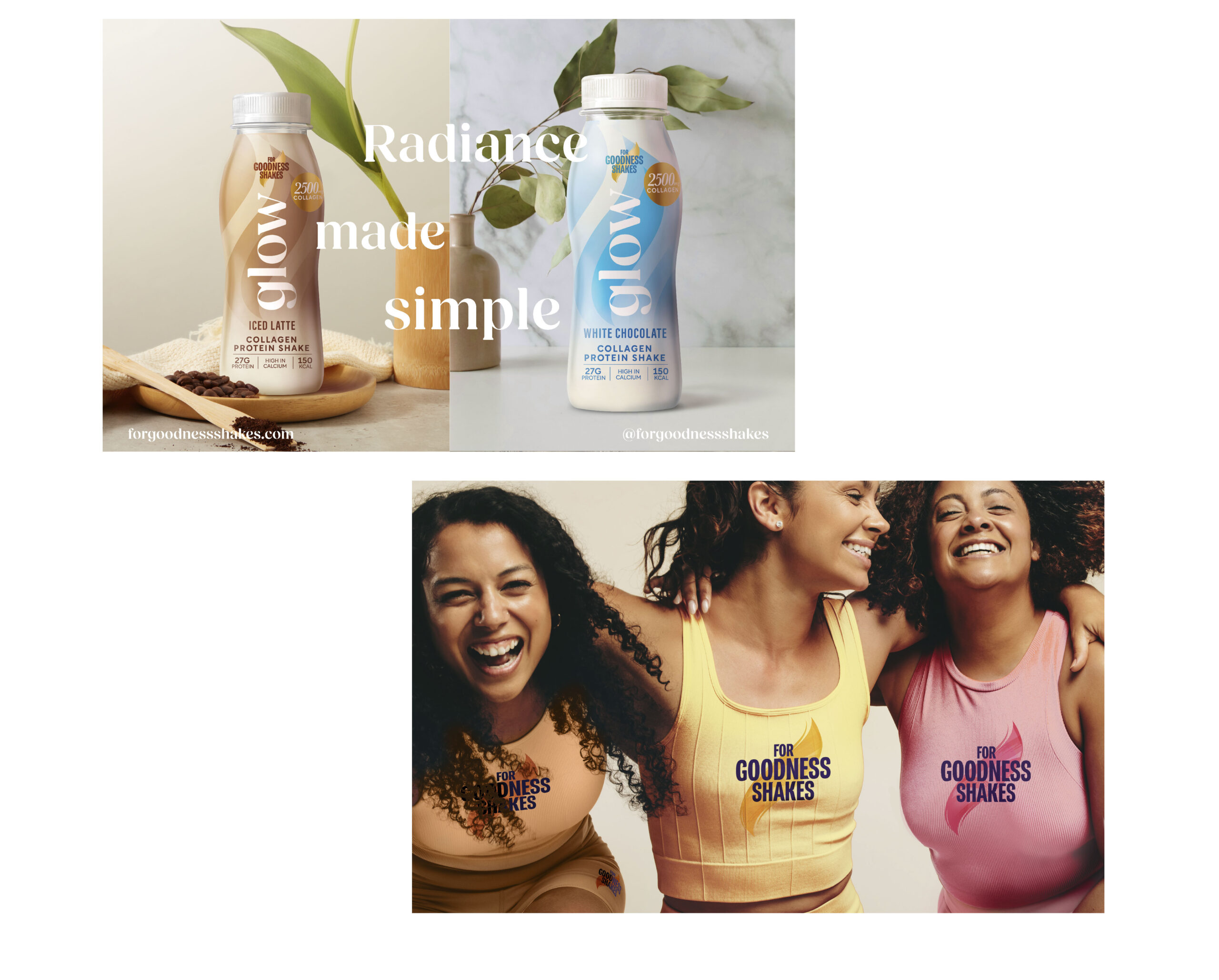
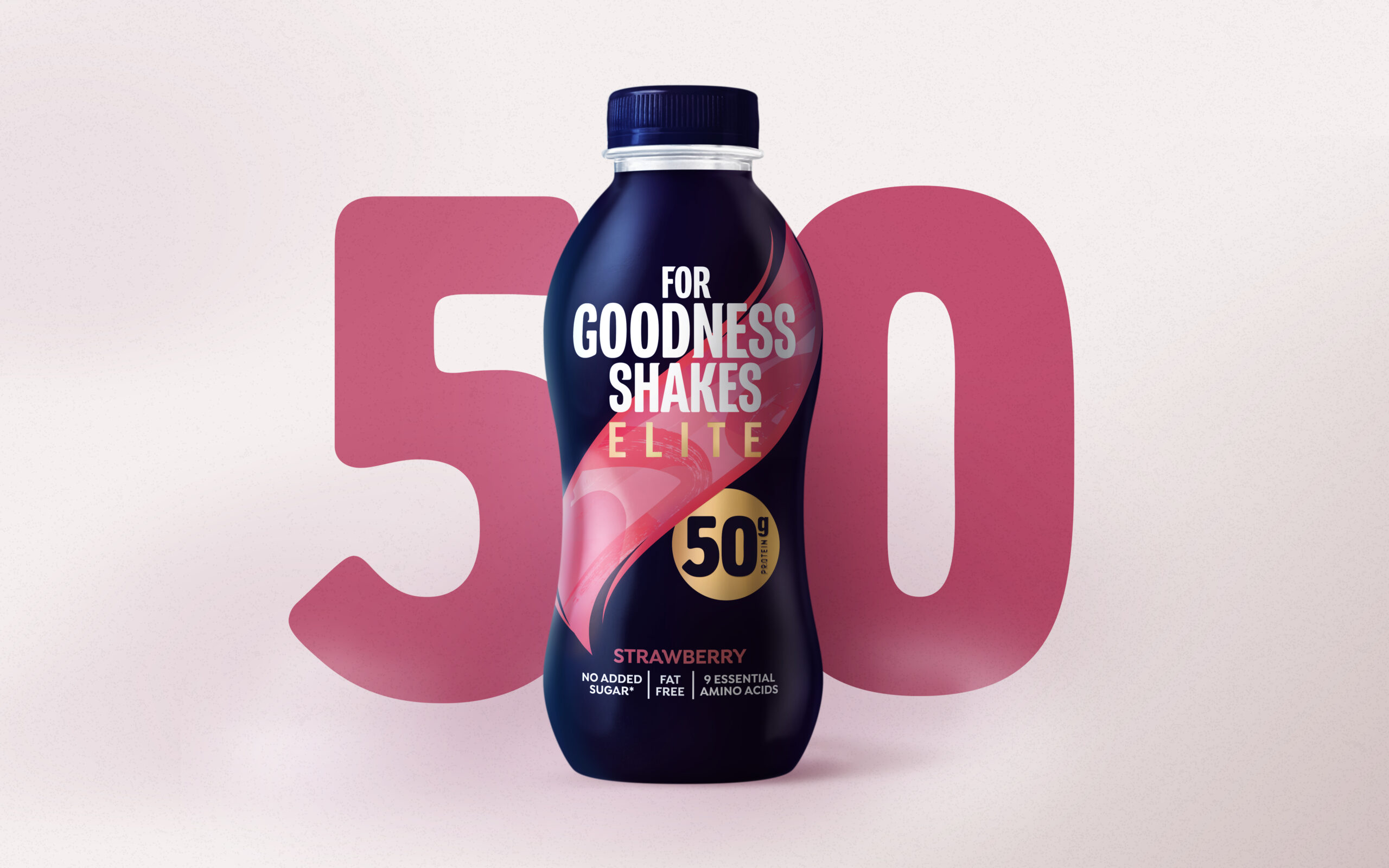
For Goodness Shakes is now a brand where “fitness finds its sunny side’”, where controlling what you eat and drink can also mean enjoying the food you put in your body, especially when it’s been made with quality ingredients and no synthetic nasties. And hot on the heels of FGS comes the company’s latest extension to the portfolio. Glow. All the wonder of collagen captured in another delicious shake.
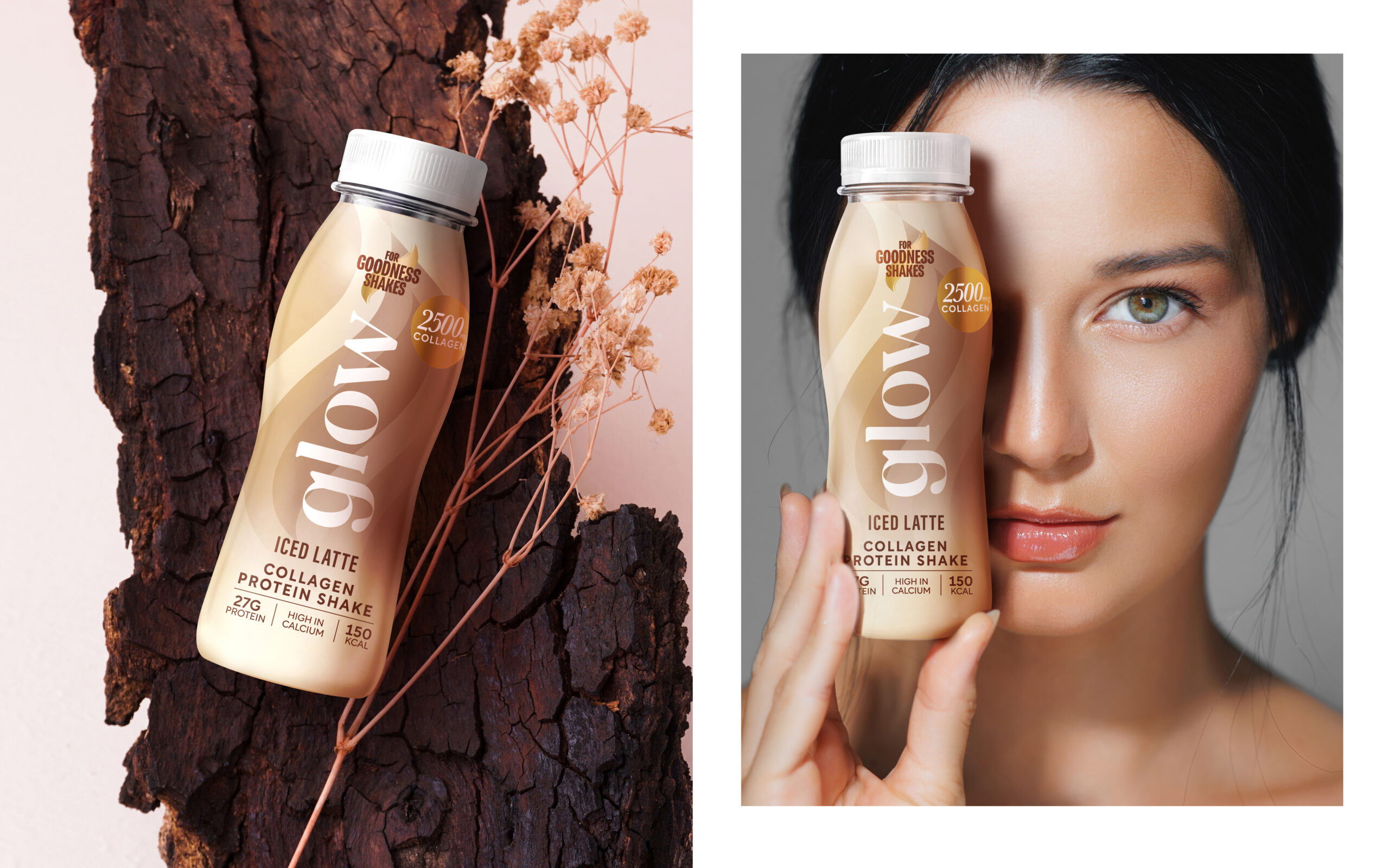
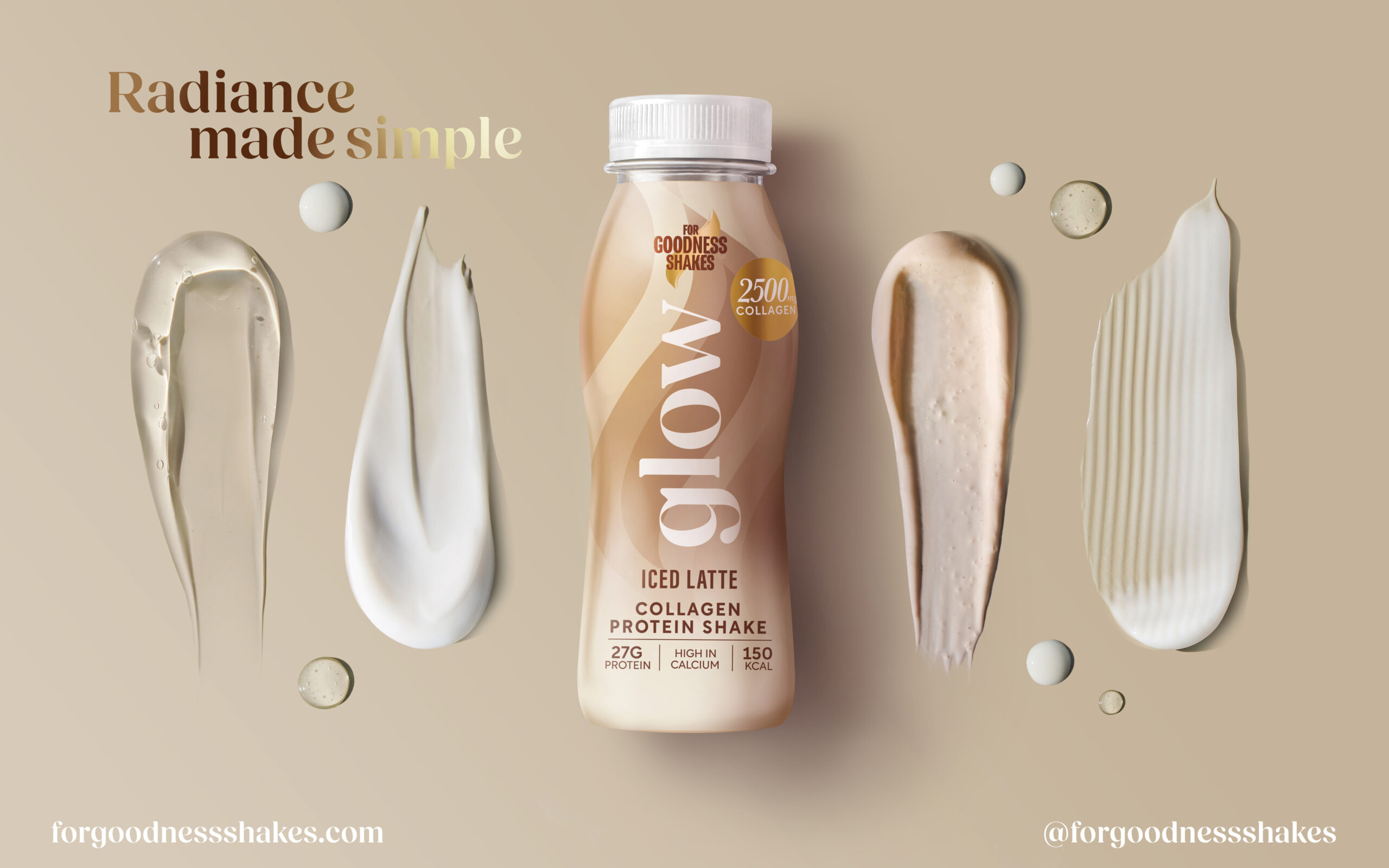
Inspired by skincare aesthetics, Glow takes protein shakes in a new direction through use of softer colours, cosmetic-influenced gradients and layered detail, also bringing new flavours to the category – Iced Latte and White Chocolate.