Up for a brighter future
We are on a mission to create positive change, improving consumers lives, as well as the long term health of the planet, through the power of strategic creativity.
Up for team work
From start-ups to category giants, we partner with businesses, whether local or global, who have the vision and bravery to take a fresh approach.
Up for healthy growth
Numbers speak volumes and we have a proven ability to drive commercial success for our clients, helping create healthier businesses.
Our approach
Dig-deep and get our hands dirty
Brand strategy is central to the way we work and our service offering. We are watchful of the waves of change in the wider world. We are fascinated by consumer behaviour.
Incisive
and decisive
Ultimately we are incisive and decisive. That’s what, we believe, makes for a brilliant brand idea and cut-through creative.
360°
brand worlds
It’s what also gives us the foundations for creating genuinely 360° ‘brand worlds’, communications, activations and experiences that span the physical and the digital.
Our services
Strategy
Trend Analysis & Reporting
Brand & Category Analysis
Consumer Research
Innovation & Mapping
Brand Articulation
Brand Architecture
Consumer Portraits
Creative Principles
Brand Manifesto
Verbal Identity
Creative
Brand Identity
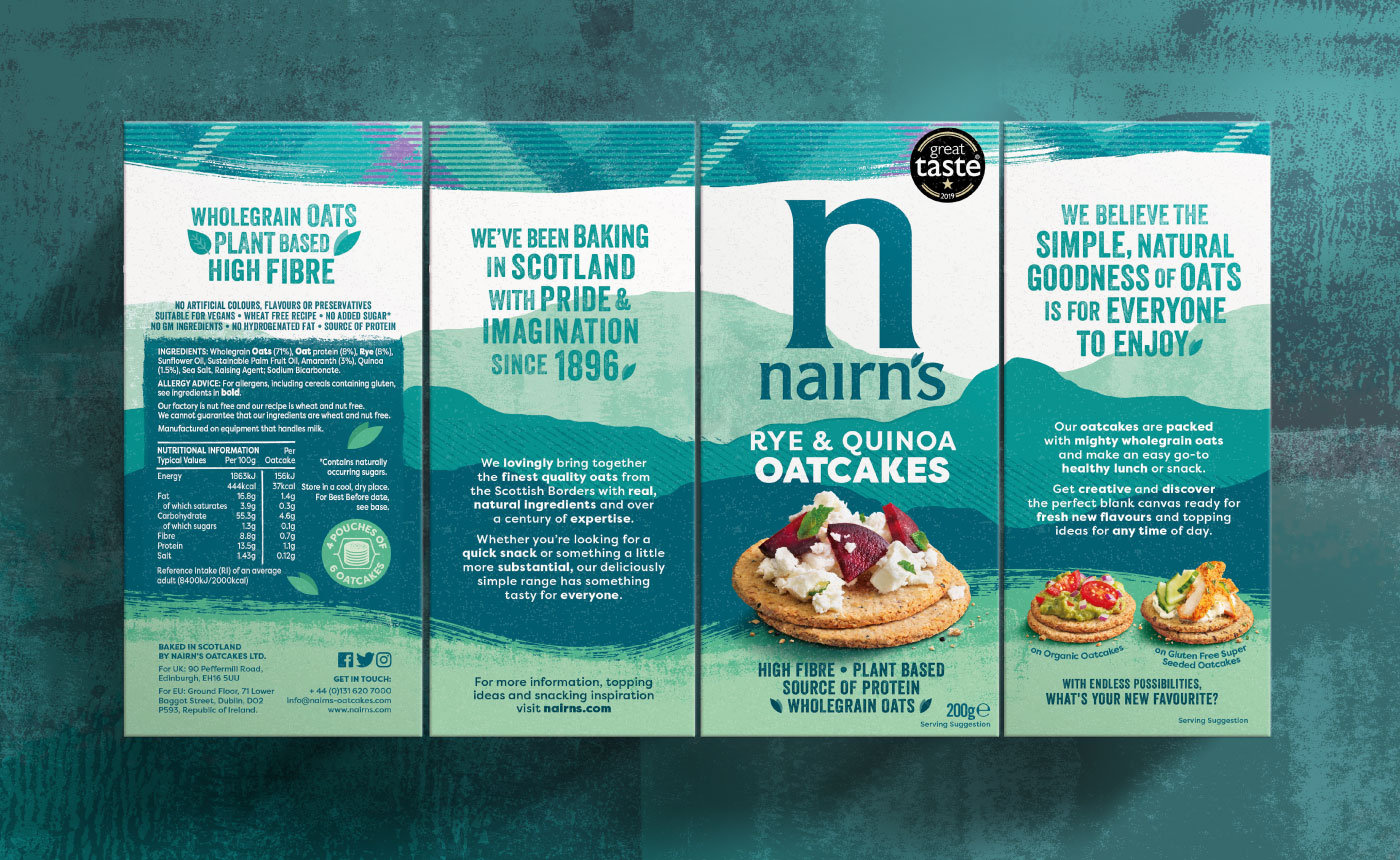
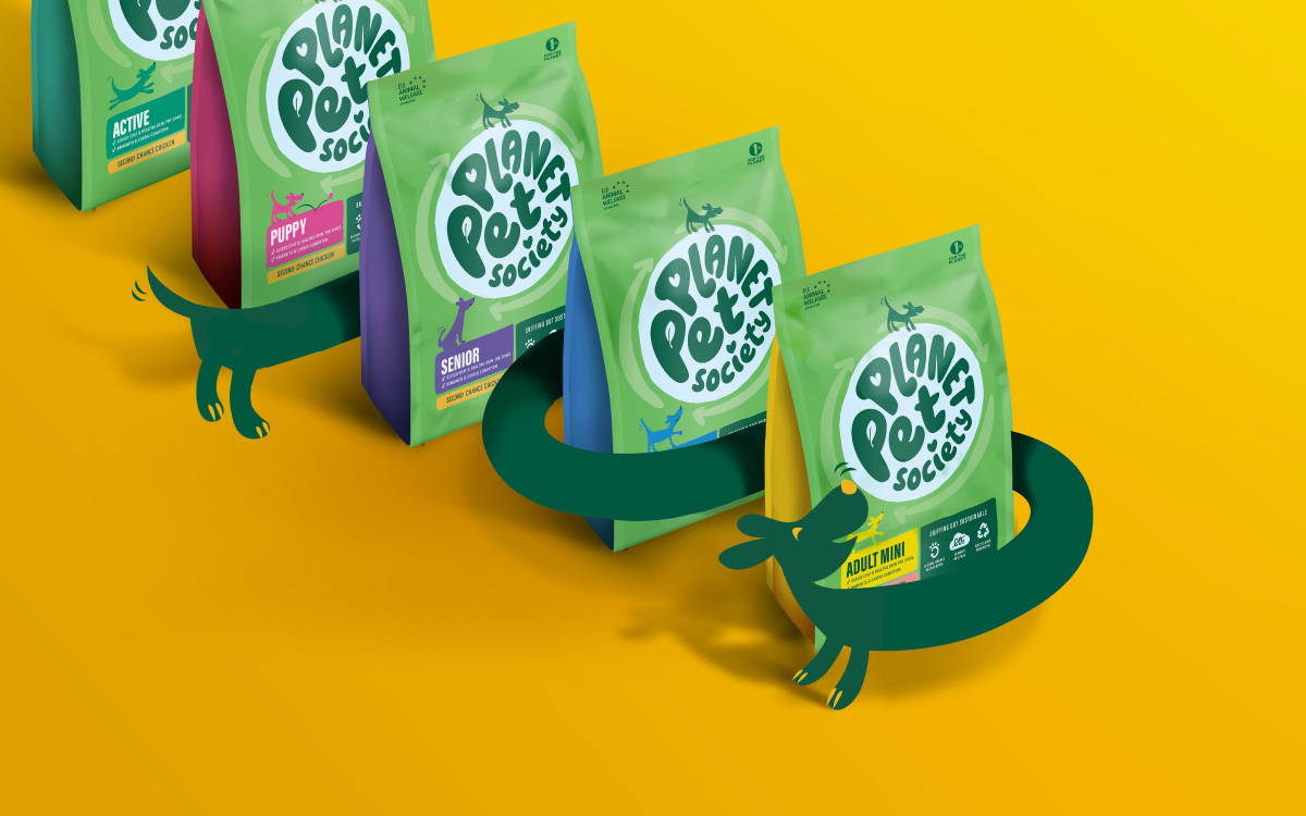
Pack Design
Brand World
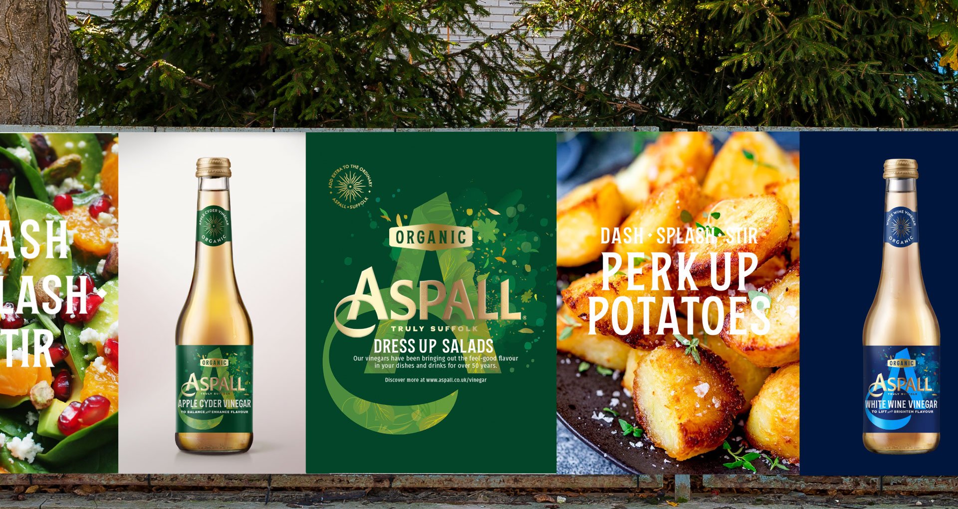
Point of Sale
Key Visual
Artwork Production
Global Rollout
Comms
Print Comms
Social Media Content Creation
Website Design
Website Build
Animations & Videos
E-Commerce


